Impact
Order Value
Increased by 20%
Ordering Time
Reduced by 40%
Order processing time
Reduced by 60%

Serving more people
The kiosks have been a game-changer for our business. Customers are spending more per order, and the faster, intuitive process means we can serve more people during peak hours.

Erfan Roudini
Restaurant Owner at Mall Of Berlin
Busy restaurants often face long lines during peak hours, leading to impatient customers and overworked staff. This can lower service quality and reduce customer satisfaction. Orderiom introduced their first version of self-service kiosks to tackle these issues. However, the user experience had its challenges—customers struggled to order combo packages, and the design wasn’t scalable.
The Kiosk, Ordermood, and the Order Manager are a part of an ecosystem for an end-to-end Gastronomy service. Feel free to read other case studies, as well.
Problem 01: Combo Packages & Upselling
Combo packages have become popular with restaurants and their customers. Prior to the redesign of the UX, there were 2 main problems, which I figured out by observing users, while using the feature.
In the previous design, all menu options were displayed at once, requiring users to scroll through a lengthy list. This setup presented several issues:
Users struggled to identify which items were optional and which were required.
The quantity limits for each item were unclear, leading to confusion.
Only two options were visible at a time, causing users to frequently miss required selections and encounter errors when submitting orders.
These challenges created a frustrating user experience, often resulting in incomplete orders and increased wait times.
Problem 02: Unscalable Design System
The UI needed to be customized to align with each restaurant’s brand guidelines. However, without a consistent and scalable design system, adapting the kiosk theme for various restaurants proved challenging. The interface struggled to support diverse thumbnail formats from merchants and to uphold effective color combinations and contrast, resulting in a fragmented visual experience across locations.
Problem 03: Outdated UI
The kiosk’s UI was not built with a cohesive design library, leading to inconsistencies in spacing, shapes, and visual hierarchy. Without a unified visual approach, the interface lacked a seamless user experience, impacting clarity and visual appeal across different screens.
Approach
To address the challenges, we adopted an iterative approach that combined on-site research, cross-functional collaboration, and rapid sketch development.

Competitive analysis
I visited several restaurant brands located in Berlin equipped with ordering kiosks. I focused on high-traffic areas during peak hours to observe how kiosks managed customer flow and experience. This allowed us to gather insights into the advantages and drawbacks of each system in a real-world context, which provided a valuable foundation for identifying key improvement areas.
Initial Sketches & Ideation
I began sketching the first concepts, with a strategy on simplifying the user journey, while retaining flexibility in the design.

I design paper sketches with infographics and keep them till the end of the project. It's more handy :)
Cross-functional discussion of solutions and enhancements
After gathering the initial insights, I conducted a collaborative session with our PM, and Engineering Lead. I discussed existing solutions and our approach, to find solutions that would resolve current pain points. This dialogue ensured that all perspectives (Product, Tech, and Design) are aligned on creating a scalable, user-friendly kiosk design.

To deliver a pixel perfect solution, I regularly checked the design on multiple screen size. While designing (right image), I had a vertical 24" display to see the prototype. For QA and UX audit (left image), I sat next to the PM and the Engineers to fix the Design issues.
Solution
By combining step-by-step navigation, a robust design system, and clear visual cues, I created a system that adapted to diverse needs.
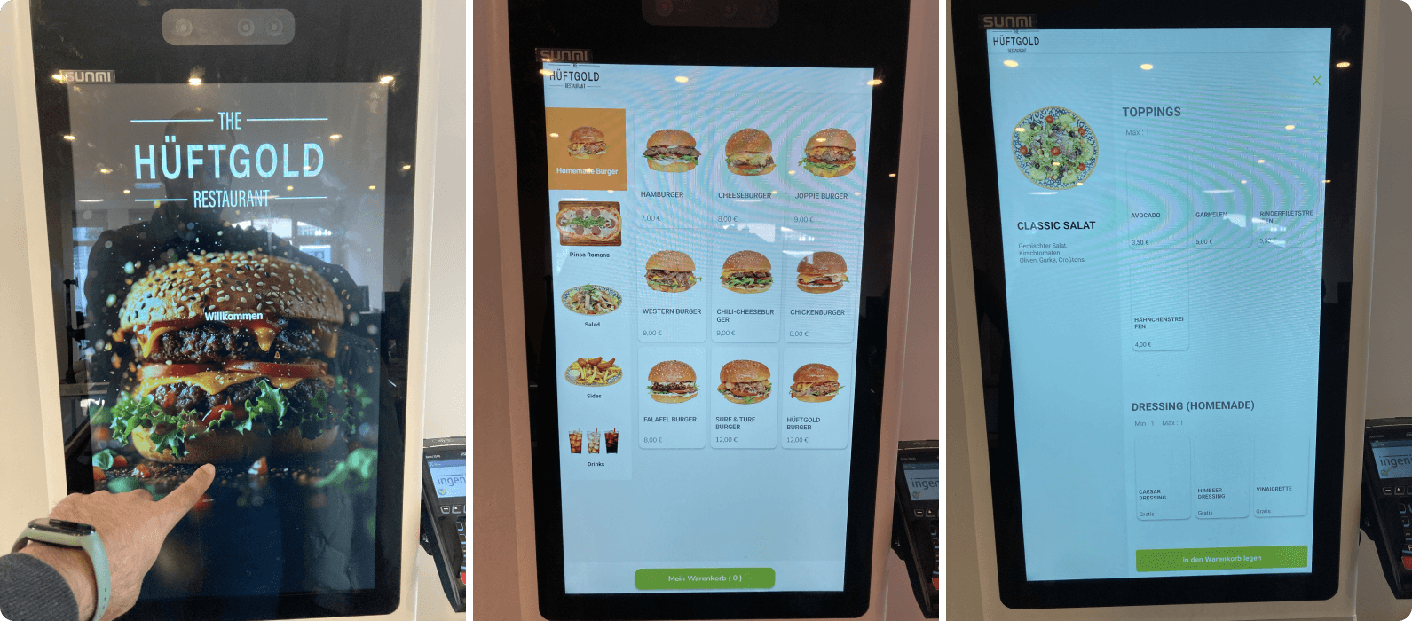
Step-by-Step Approach for Combo Packages
To simplify the ordering process and reduce user errors, I implemented a step-by-step approach for combo packages. By breaking down the process into manageable steps, users could easily navigate back and forth to review or modify their selections. A key feature was the auto-transition for single-select items, like dish size, which allowed for a faster, more seamless experience. For multi-select items, I introduced intuitive plus and minus buttons, clearly indicating the type of action needed. This structure was both user-friendly but also scalable, as it allowed restaurants to customize combo packages, with the UI dynamically adjusting to accommodate different item sets.
Scalability
To ensure the kiosk’s design was adaptable across various restaurant brands and hardware, we developed a scalable design system for the layout. This system was flexible enough to support screens of different sizes (24, 27, and 32 inches with 9:16 ratio), ensuring a consistent experience regardless of the device. The color system I implemented was monochromatic, making it easy to integrate a wide range of restaurant branding, from diverse thumbnails to varying brand colors. Additionally, I included a dark theme layout to cater to different restaurant environments, further enhancing the customization and scalability of the design.

I used Monochromatic color system to build a scalable theme.

I added 3 versions for the order review page, each service different customer needs. From left: 1) Overview only; 2) Pricing breakdown; 3) Discount codes & Tips.

On kiosks, payment is usually with cards. But some customers request for the flexibility of paying with cash. The left design shows the flow for paying at the checkout, and the right one is for paying with cards.

I don't usually like it when promotional pop-ups come in. But some businesses request such features. So, I added a design where the product shows Extras before checkout.
Clear Call-to-Action (CTA)
To drive user engagement and guide them through the ordering process, I focused on clear, prominent CTAs. By strategically using color, contrast, and animation, I ensured that the most important actions caught the user’s attention. Micro-interactions added an extra layer of feedback, providing users with subtle cues as they interacted with the kiosk, making the entire process intuitive and frictionless.

Impact
Order Value
Increased by 20%
Thanks to better upselling opportunities and a smoother ordering process.
Ordering Time
Reduced by 40%
Enabling quicker service and minimizing wait times for customers.
Order processing time
Reduced by 60%
Resulting in faster customer flow and less pressure on staff during busy periods.
Our redesigned ordering kiosk had a significant positive impact on the restaurant’s efficiency and customer experience.